Background and Work Experience
Growing up with a Private Library
Born into a middle-class family, Prinya Rojarayanont grew up in his father’s stationery and school supply store in Bangkok. His spare time from school was spent not far from a corner of the shop where his mother ran a newsstand selling magazines, newspapers and children’s books. It was at this ‘private library’ of his that young Prinya soaked up stories of noted scientists and inventors, and dreamed of one day becoming a famous figure himself who would leave behind ‘something good’ to the world. Young Prinya would see the wide variety of shapes and forms of those early Thai typefaces every day. This familiarity with letterforms would become immensely useful for his type-design work in his adult life.
During high-school years at Bangkok’s elite Panabhandhu School, Prinya was awed by the sight of a futuristic school annex designed by Ong-ard Satrabhandhu. Its very modern outlines did much to inspire the teen Prinya to further his study at the architecture faculty of Chulalongkorn University. While there, his interest in building design, however, was replaced by a new love; it was two-dimensional graphic renderings that he came across at the faculty’s graphic design library that had sparked his new enthusiasm.
“It felt like a continuation of my mother’s newsstand. I knew it then it had to be my future calling. Many works of Bob Gill did much at the time to influence my early designs, such as the covers for Thailand in the 1980s and In Retrospect.”
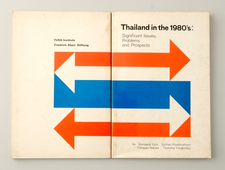
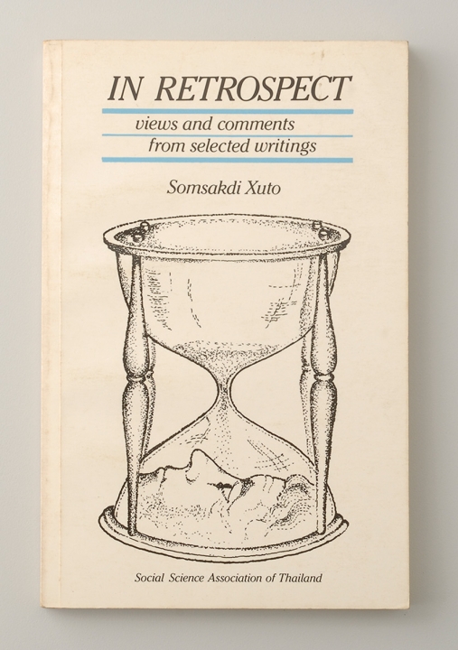
Prinya’s junior years at university coincided with the unsettling period following a major political uprising led by student movements in October of 1973. Students-led activities and protests were at their peak in the ensuing years, and social activism was occupying much of Prinya’s time in campus. According to him, this was a happy and most memorable time of his life. He took to art direction and conceptualization of political and protest graphics while enjoying youthful interactions with students from other faculties who shared similar political idealism.
All this came to an end following the violent crackdown of student power by military-backed authorities on October 6, 1976. To avoid persecution from the establishment, many student-activists either fled the country or went into hiding, including Prinya. Upon his subsequent return to university, however, he chose to discontinue his architecture studies having convinced himself that he would feel more comfortable working with graphics and publication design.
This led to the founding of Dear Book. Incorporated in partnership with Prasart Virakul, his classmate in mid-school, and a couple of freshmen from the university, Dear Book offered graphic design and print production services. The company’s early output consisted of professional looking medical pamphlets commissioned by international pharmaceutical companies.
A major turning point for Dear Book came with the advent of Desktop Publishing equipment around the year 1984. DB partners, Prasart Virakul and Surapol Wesa-rachawes, began to augment DB’s graphical capability with services in page layout, image setting. and with offers of a dozen new digital typefaces in their DB Series of fonts. The fonts managed to effectively replace the use of dated dry-tranfer letters or even photo-typesetting, thereby providing increased convenience and speed for art preparation. Notable output in this period was the first-ever making of an annual report for SCG where the art for the book was completed entirely using digital processes.
As Thailand was still lacking proper intellectual property laws, DB’s fonts were freely copied for use by the multitude of service providers in the trade. The situation meant the draining away of a huge chunk of DB’s business. Such unauthorized use of the company’s digital assets continued for many years until proper copyright laws came into being eventually and put a stop to the damaging practice.
After the sudden decease of Surapol due to illness in 1994, Prinya took on a more active role in the business, while devoting some of his effort into promoting digital graphic design through public lectures, trade talks and print articles. These activities, he said, were his way of honouring Surapol’s tireless contributions to Bangkok’s digital graphics circles.
The financial market meltdown of 1997 (or the Tom Yum Kung crisis) that managed to paralyze many Asian economies, led to the commercial closure of Dear Book. Whatever left of the business was carried over by Prinya and a handful of colleagues under the new name DB Designs. The firm’s proprietary fonts in the DB Series had remained a revenue asset thus helping to support it financially through this transition period. The new company evolved into a specialized digital font vendor, being buoyed by advances in font technology, internet commerce, as well as emerging intellectual property laws.
Business Philosophy and Direction
Create something original
Prinya said he had found that good designs are created to meet their purpose; and superb designs, in addition, must contain very original concepts – or ideas that cannot be copied, imitated or modified for other uses. This design ethic he calls Targeting Originality.
Many of his graphic pieces do indeed reflect his efforts towards originality. Some have won prestigious design awards over the years. Examples are mentioned below:
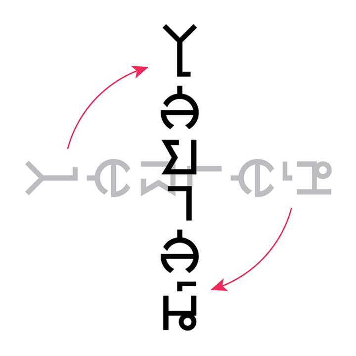
A typeplay to celebrate HM King Bhumibol’s Seventh Cycle Birthday. For this work, Prinya employed the familiar music notations to render the Thai phrase “Song Phra Charoen,” or Long Live Your Majesty. This ingenious graphic device immediately reminds a viewer of the King’s well-known musical talent in jazz and blues, while it spells out a birthday well-wishing for the monarch.

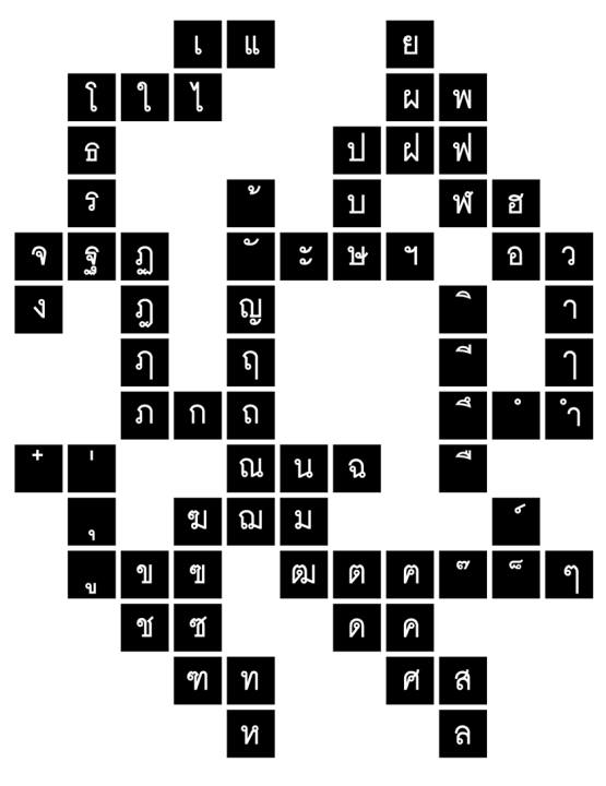
The letterforms in a Thai character set share a high degree of modularity in their letter segments or strokes. Seeing a way to facilitate character design and ensuring form consistency, Prinya came up with a design aid. It is a diagram that shows the geometrical relationships within a character set. With this device, a user/designer may start drawing a letterform from any square in the diagram, and continue to a near look-alike character on an adjacent square. The process may be continued in this fashion until the entire character set is completed.
Intriguing Visual Devices
for instant eye appeal
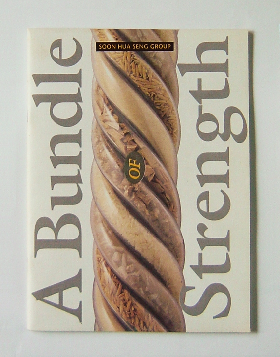
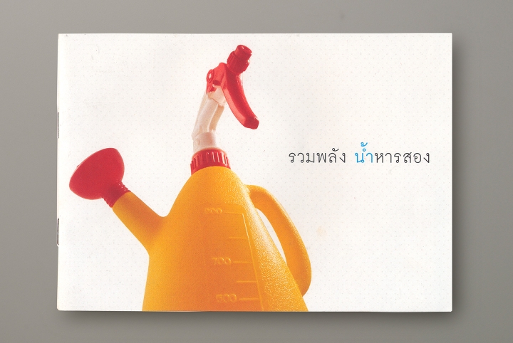
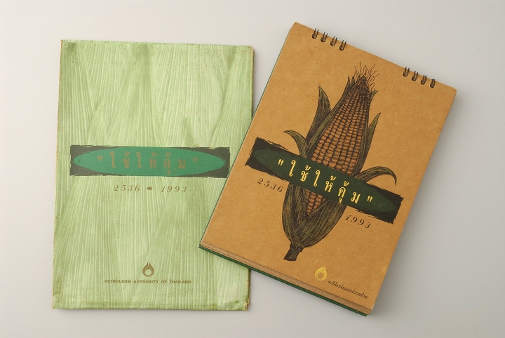
Many of Prinya’s works have also relied upon oft-repeated adages or teachings of old. On this basis, Prinya would manage to create interest by adding novel visuals. This approach would produce results that are as captivating artistically as they are effective pieces of communication. A range of publication designs exemplify this method, e.g. A Bundle of Strength; Let’s Save Water; and Use It to the Full.
The DB brandmark illustrates Prinya’s penchant for intriguing letterforms. The mark functions like a stylish monogram of the Thai characters for D and B that are morphed into a single glyph.
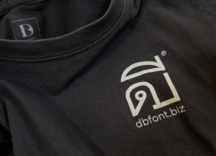
His love for pure, simple lines is evident in his rendering of typefaces such as DB Fongnam and DB SaiYart, as well as in his pro bono designs for several emblems for student fraternities.

Left: Triam Udom Suksa School, Class 35
Right: 1974 Chulalongkorn Freshman
Prinya’s Cherished Works
- Book Cover: Thailand in the 1980s (1981)
- Illustration: In Retrospect (1982)
- Company Profile: A Bundle of Strength (1990)
- Calendar: Use It to the Full (1993)
- Annual Report: PTT Going International (1993)
- Remembrance Book: Life and Work of Surapol Wesa-rachawes (1994)
- Brandmark: DB Font (2002)
- Booklet: Let’s Save Water (2003)
- Poster/Typeplay: Long Live the Jazz King (2008)
- Game: OXELI Chess (2010)
- Typefaces:
- Text: DB Fongnam (1989)
- Display: DB Ozone (2007)
- Vertical Display: DB SaiYart (2015)
- Design Aid: Prinya’s Letterform Map (2017)
- Pangram: Prinya’s Pangram for Thai Character Set (2025)

Cultural Assets and Design Work
Realizing the benefit of intangible assets
Prinya reckons that Thailand’s intangible cultural assets may be incorporated into any design, either with prominence, or with subtlety. A measure of cultural value can be achieved this way.
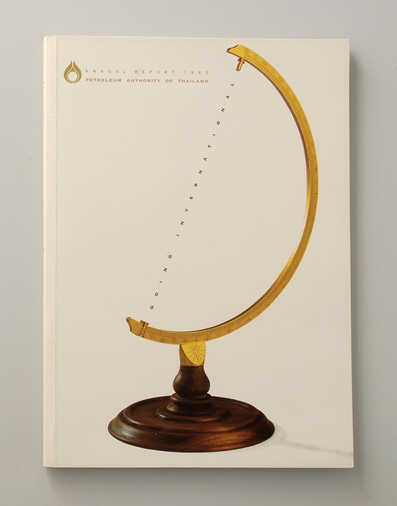
Prinya cited as an example his design for an annual report for PTT, a leading energy conglomerate. At the time, PTT was beginning its forays into the lucrative international market.
“I came up with a visual of an atlas globe with its orb missing, leaving only a dotted axis, and a line that said ‘going international’. So it sort of implied that PTT was not yet there, but was making every effort to capture the missing globe. It was an understatement, or modesty, which is a Thai virtue; and the client loved it.”
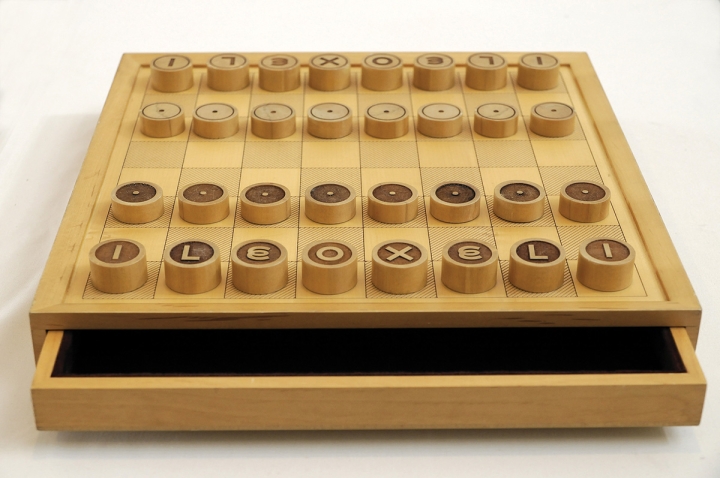
An avid chess player, Prinya for some years had toyed with the idea of combining the pieces of Eastern and Western chess configurations into a new format of play. His idea bore fruit in 2010. He labeled each rank of his chess pieces with a capital letter that denotes the allowed direction of a move. The five letters for the ranks happened to form the word OXELI, hence the name of this new chess game.